zyw-portfolio-2026.3
| home page | data viz examples | critique by design | final project I | final project II | final project III |
Critique by Design – Viz of Labor Market Exit Age
Text here…
For each step below, you should document your progress as you move forward. In terms of tone, think of the writeup as though you’re keeping journal of your step-by-step process. You should include a any insights you gained from the critique method, and what it led you to think about when considering the redesign. You should talk about how you moved next to the sketches, and any insights you gleaned from your user feedback. Document what you changed based on the user feedback in your redesign. Finally, talk about what your redesigned data visualization shows, why you selected the data visualization you did, and what you attempted to show or do differently.
You can include screenshots, sketches or other artifacts with your narrative to help tell the story of how you moved through the process. Again, make sure to avoid including any personally identifying information about your interviewees (don’t list full names, etc.). While this template serves as a guide, make sure to reference the assignment writeup on Canvas for the official guidance. This template does not include all guidance mentioned on the assignment page.
Step one: the visualization
Include link to the original data visualization (or screenshot - make sure to correctly cite your sources, etc.). Include paragraph or two on why you selected this particular data visualization. For obvious reasons, the data visualization you select should come from a publicly accessible source.
link to the original data visualization: https://www.statista.com/chart/29570/european-average-effective-labor-market-exit-ages/
Source: Statista.com
Step two: the critique
Don’t forget to complete the Google Form found on the assignment page. You can summarize your thoughts here.
Worked well:
- The color gradient clearly shows differences in retirement age across countries, making it easy to identify patterns at a glance.
- The title is engaging and clearly communicates the main question of the visualization.
- The layout and the coler pattern is nice to look at overall.
Didn’t Work well:
- Exact values for each country are not labeled, so it’s hard to know precise retirement ages.
- Also, the country names are not labelled, so for people with little European geographic knowledge it would be hard to understand.
- Some countries are small and difficult to see clearly on the map.
My Thoughts for Redesign:
- Add labels or tooltips to show exact values for better readability.
- Use a different chart type- to make comparisons easier.
- Include additional dimensions (such as gender differences or changes over time) to provide more info.
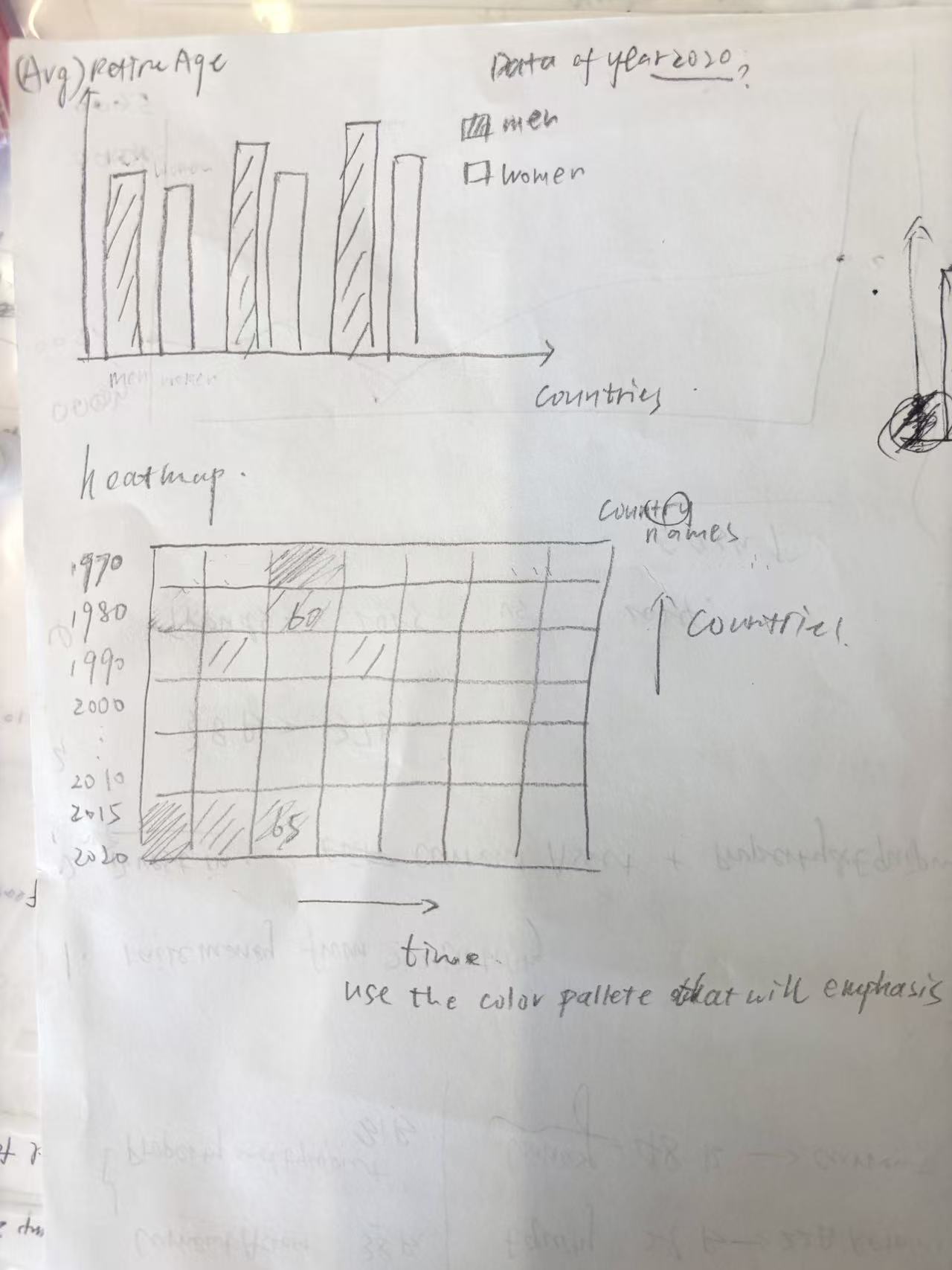
Step three: Sketch a solution
Step four: Test the solution
Before you conduct your interviews, prepare a simple script. Use this as a guide and as a way to take notes as you go forward. Come up with your own list of questions you want to ask for the selected visualization. Keep the questions broad so you can get the most value out of your feedback. Then, document answers to your questions here.
Questions to ask (modify these for your own interviews):
-
Can you tell me what you think this is?
-
Is there too much information in one single graph?
-
Is it clear and readable for the intended audience?
-
Is there anything you find surprising or confusing?
-
Is there anything you would change or do differently?
Results:
Don’t identify or share personally identifiable information (PII) about the people you spoke to.
I got two interviewee to answer my questions and they gave me helpful advice. The synthesis of their answer and our discussion based on that can be found below.
Synthesis:
What patterns in the feedback emerge? What did you learn from the feedback? Based on this feedback, come up with what design changes you think might make the most sense in your final redesign.
Feedback I got:
- Using a heatmap is an interesting choice, but displaying all countries and all years in a single table results in too much information and can be overwhelming. It would be better to focus on a specific subset of the data.
- more attention should be paid to the use of colors
- Setting the time axis horizontally seems more natural.
What I learned from the feedback:
- We should first thoroughly explore and understand the original dataset. Based on its characteristics and underlying trends, then choose appropriate visualization methods and decide what aspects of the data to highlight.
Step five: build the solution
Include and describe your final solution here. It’s also a good idea to summarize your thoughts on the process overall. When you’re done with the assignment, this page should all the items mentioned in the assignment page on Canvas(a link or screenshot of the original data visualization, documentation explaining your process, a summary of your wireframes and user feedback, your final, redesigned data visualization, etc.).
After completing the interviews, I decided to focus on my classmates’ suggestion to reduce the amount of data to avoid clutter and to concentrate on a specific subset. At the same time, I also wanted to experiment with different types of visualizations, since the original dataset includes multiple dimensions—country, gender, and year—which are difficult to effectively present in a single chart.
To present the characteristics and trends of the original dataset as comprehensively as possible, I used three different types of visualizations. First, I created a heatmap to show the average retirement age for each country across different years, using color spectrums to visually represent the magnitude of the values. I also focused on the top 5 and bottom 5 countries in terms of average retirement age to reduce cluttering and highlight the most significant patterns.
Next, I used a dumbbell chart based on the most recent data (2020) to illustrate the differences in retirement age between genders, as well as the variation in gender gaps across countries.
Finally, I created a traditional line chart to more clearly show how retirement age changes over time.(countries with top 5 average retirement age)


References
List any references you used here.
Data Source: https://data.world/makeovermonday/2023w16/workspace/file?filename=Effective+labour+market+exit+age.xlsx
AI acknowledgements
If you used AI to help you complete this assignment (within the parameters of the instruction and course guidelines), detail your use of AI for this assignment here.
I only used AI to help me rephrase and organize my comments.